Online sportsbook & casino
Redesigning Registration Around the First Deposit
How I redesigned a registration flow with over 50% drop-off into a guided journey from sign-up to first deposit.
Role
Product Designer
Timeline
2021
Company
Undisclosed
Platforms
Desktop · Mobile web
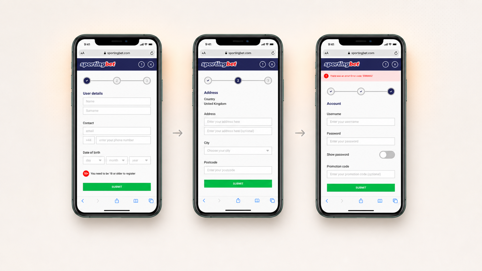
Overview
Registration is the front door of an online gaming platform. It is also where acquisition turns into a customer: someone who abandons registration has already cost the business money to acquire, without generating any value.
In a regulated market, registration cannot simply be reduced to a few fields. Operators need enough information to verify identity before an account can be funded. The existing flow collected everything it needed, but gave users very little help getting through it — and more than half dropped out.
I owned the redesign end to end, from research and journey design through to high-fidelity UI, prototyping and the shared style guide used by the desktop and mobile teams.
A front door that lost most of the people who opened it
Four things worked against completion at once.
- No sense of progress. Users could not see how much was left, what each section was for, or why certain information was required.
- Errors were difficult to recover from. Errors told people something was wrong, not what to fix — or what a valid answer looked like.
- The motivation disappeared. Bonus campaigns brought people to the site, but the offer vanished once registration started — exactly when users needed a reason to continue.
- Registration ended too early. Creating an account led to an empty account rather than naturally into the first deposit.
More than half of the people who started registration did not finish it — on a platform where every one of those starts had been paid for.
Learning the market and the users before touching the form
I ran three strands of research in parallel.
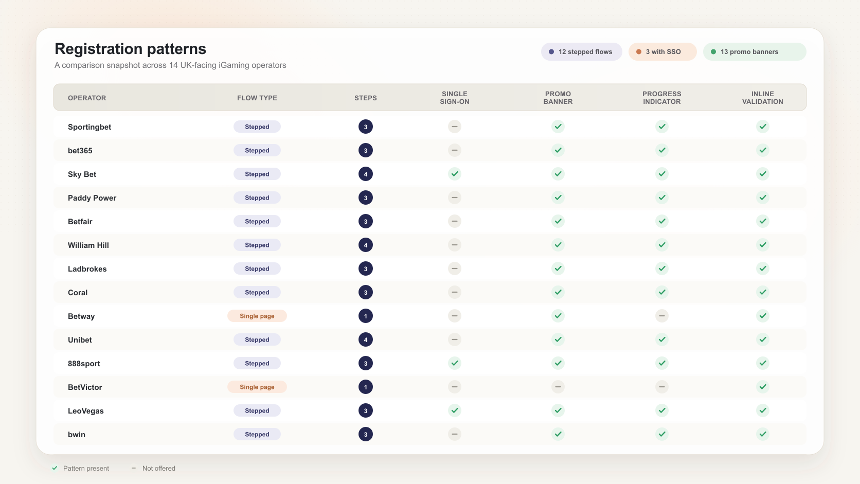
Competitive analysis
I analysed 14 iGaming operators in the same market, comparing step structure, information requirements, offer placement and error handling. This showed both the patterns users were already familiar with and where there was room to improve.
User interviews
The product had over 30,000 active users. I worked with customer support to recruit people with different levels of experience and playing behaviour, rather than relying only on frequent or highly engaged players.
The interviews covered both our product and competitors people also used. Comparing those experiences helped separate isolated usability issues from broader expectations about how registration should work.
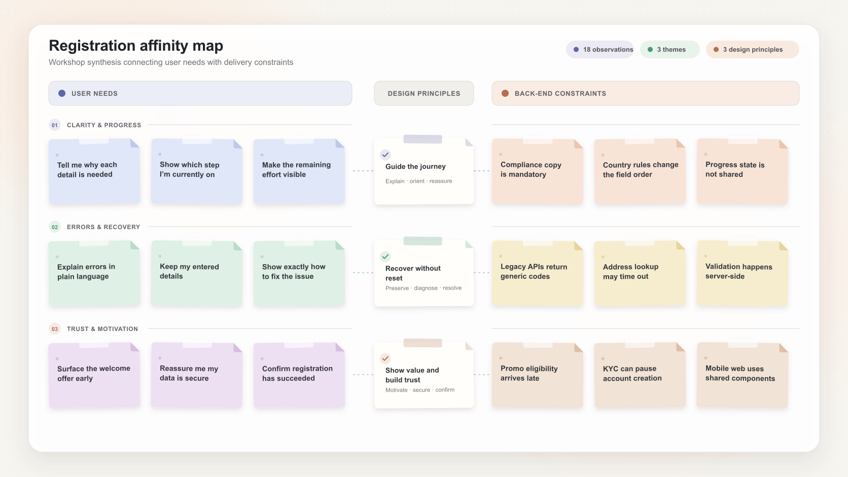
Affinity mapping
I ran an affinity-mapping workshop with stakeholders to group the findings, explore journey variations and surface back-end constraints early, before they became design problems.
From findings to direction
Three pieces of work turned the research into something the team could design and build against.
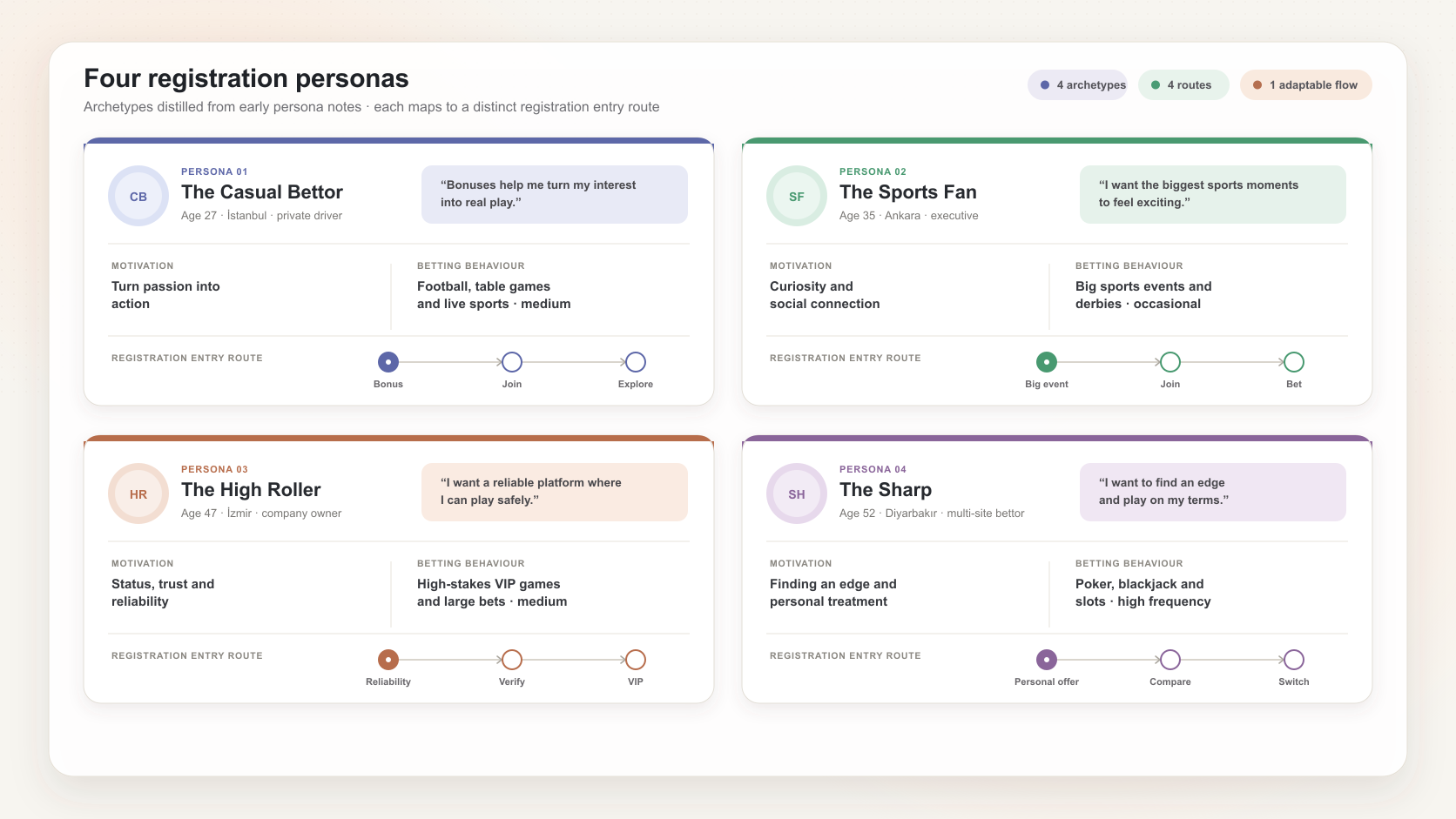
Entry behaviours
Working with customer support, I defined four behavioural archetypes based on what brought users into registration. They became test cases for checking whether one journey could support different acquisition routes.
User stories
I translated the findings into user stories so design, product and engineering could discuss requirements in the same language.
User flows
Rather than starting from a blank page, I reworked the existing journey: resequencing the form, bringing the offer to the front and extending registration through to first deposit.
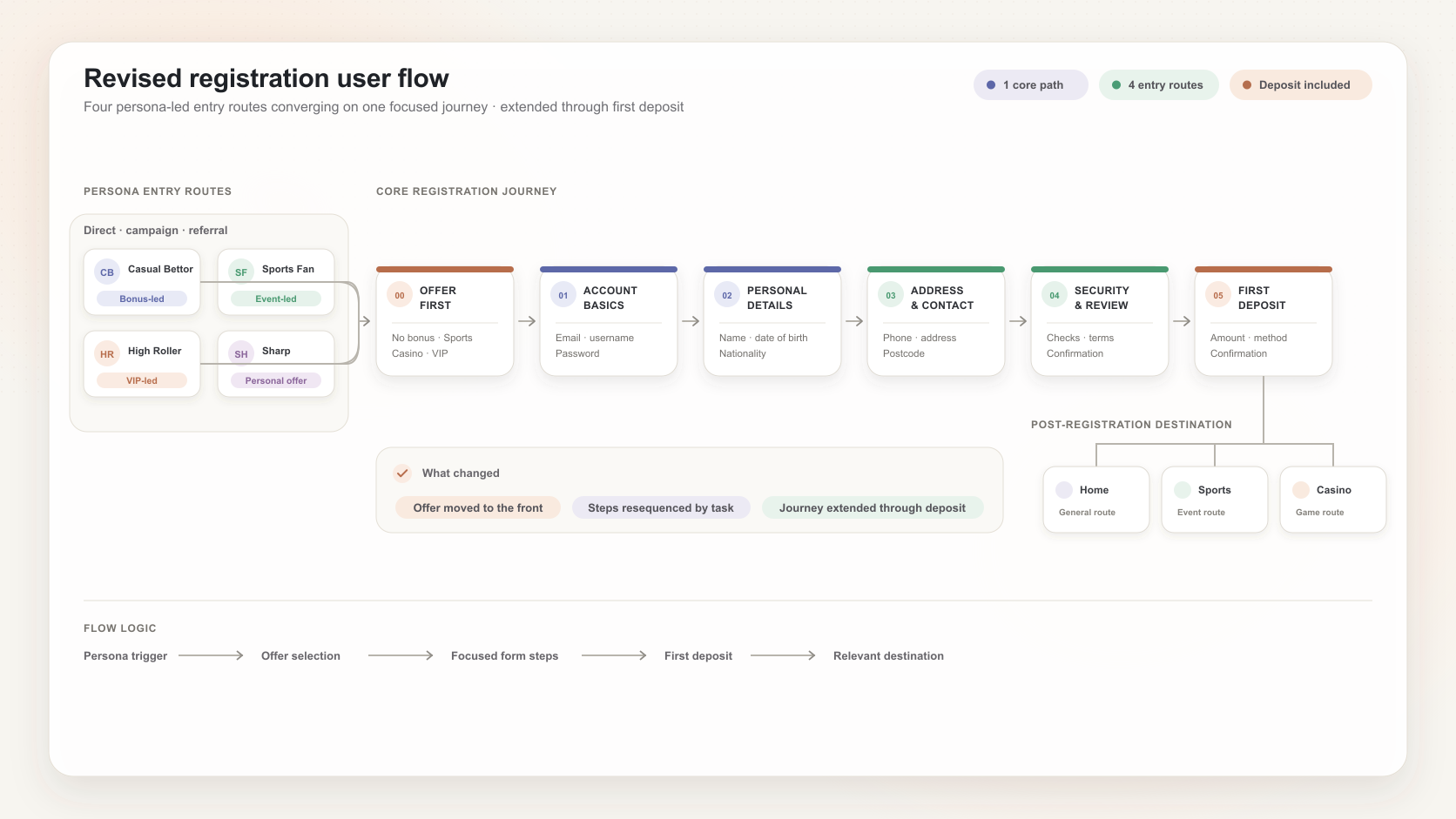
The redesign, in four decisions
- Keep the reward visible. The campaign that brought someone to registration stays visible throughout the journey, so the reason to finish does not disappear once the form begins.
- Make progress and recovery obvious. The form is divided into clear sections with visible progress. Error messages identify the problem and explain how to fix it rather than returning generic codes.
- Continue through first deposit. Account creation leads directly into deposit instead of ending on an empty account. The benefit of funding the account is explained at the moment it becomes relevant.
- Make desktop and mobile behave as one product. Two teams owned the implementations, so components, states and behaviours were specified centrally rather than allowing the two versions to drift apart.
Following one new user end to end
Registration is usually designed as a form. It is more useful to design it as the middle of a journey that starts with a campaign and ends with a funded account.
Follow one new user from campaign to first deposit — choose a stage to see what happens there.
A visitor arrives from a campaign — the acquisition cost has already been paid before they see a single field.
- The offer that brought them in continues into registration rather than being dropped at the door.
- What it takes to claim it is visible before the form starts.
The form is broken into understandable sections — details, address and account — each with visible progress.
- Every section states what it is for, so the effort is never unexplained.
- Identity information is grouped where it makes sense rather than arriving as one long wall of fields.
Something fails validation — the moment the old flow lost people.
- The message names the field that failed and describes what a valid answer looks like.
- Everything already entered is preserved, so recovery is a correction rather than a restart.
The new account is funded. A registration that never reaches a deposit has not produced a customer.
- Account creation hands directly into the deposit journey.
- The benefit of depositing is shown in context, rather than leaving a new user to find the next step alone.
Keeping two build teams on one product
Desktop and mobile web were built by separate teams. Without a shared reference, the same journey could easily have shipped with different components, behaviours and error states.
I created a style guide covering the components, states and interaction rules both teams needed, then used it alongside the high-fidelity designs as the shared implementation reference. It was the least glamorous part of the project and probably the highest-leverage.

The high-fidelity designs showed the whole journey in context, including the error and edge states. The prototype below runs the complete flow.
What happened after launch
50%+ → <5%
Drop-off during registration
2 weeks
Time to observe the change after launch
Of users who started registration, more than 50% previously abandoned before completing it. In the first two weeks after launch, that rate fell below 5%.
Measurement caveat: the redesign launched alongside a marketing campaign, so I cannot attribute the wider conversion increase to design alone. Registration drop-off is the cleaner signal because it measures users who had already entered the flow. If I were running the project again, I would instrument section- and field-level abandonment before launch so the effect could be measured more precisely.
What I'd carry forward
The instinct with a leaky form is to make it shorter. That was not the answer here. In a regulated product much of the information was mandatory; the opportunity was to make the effort understandable and the value of completing it visible.
The bigger lesson was about where to draw the product boundary. Registration had been treated as a form ending at account creation. Looking at the full journey — from acquisition campaign to funded account — exposed problems that optimising the form alone would never have solved.
If I ran the project again, I would test recovery states directly with users and define section-level analytics before launch. Both would have made the design decisions, and their eventual impact, easier to validate.